TL;DR
- Project Overview: Addressing the significant greenhouse gas emissions from construction, aiming to inform users for sustainable choices.
- Scope and Constraints: No cost limit, a tight 6-week timeframe, and a shift from owner builders to homeowners.
- Assumed User Problem: Australian homeowners (30-60) seek sustainable housing options but struggle to find relevant information.
- Transparency is key: Insights from 10 homeowners emphasized transparency, electricity usage concerns, pricing, and government involvement.
- Pivot to energy usage: Refocusing on energy transparency to alleviate bill shock and promote sustainability, aiming for customer retention.
- Breakdown of usage & setting limits: Workshoped with 3 users guided MVP features: usage graphs, activity breakdowns, and setting monthly limits.
- Info hierarchy still unclear: Material UI used for design, with insights from testing highlighting clarity issues in account info and navigation.
- Validation: Hi-fidelity testing with 5 users led to refinements like a green banner and more feedback on usage graphs.
- Learnings: Developed skills in design thinking, time management, intuition-trust, and flexibility, with insights for faster iterations and intentional design application.
About Enerlyze
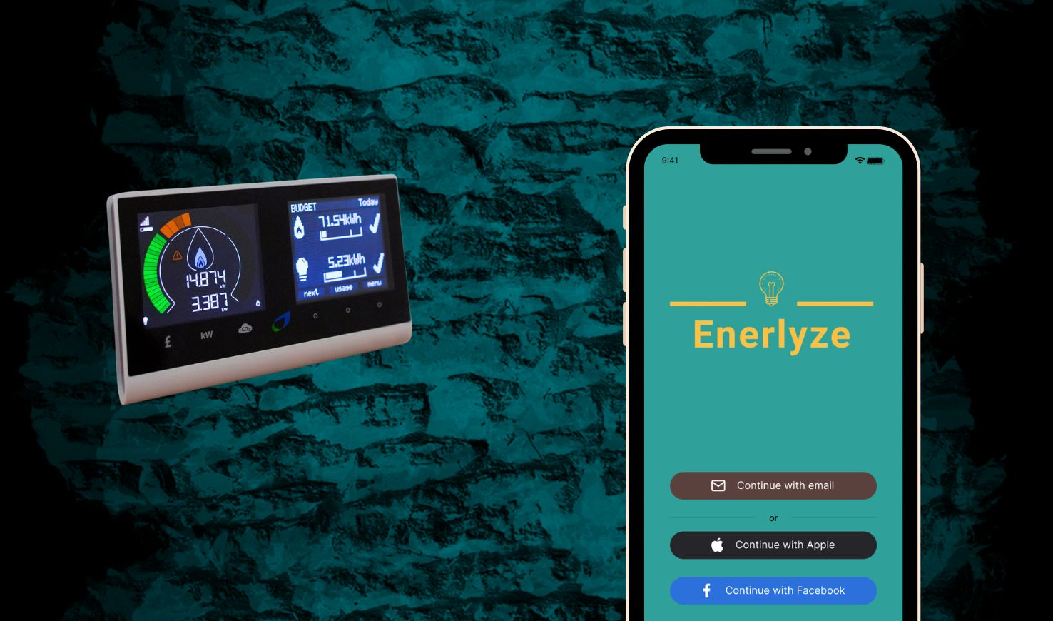
Enerlyze is a personal project to explore household energy usage solutions
Project Overview
The construction sector’s greenhouse gas emissions account for 40% of global emissions (approximately) (Deloitte) My assumption: If people are better informed on construction choices, they can shift toward more sustainable products.
Scope and Constraints
No cost constraint, the time of this project was restricted to 6 weeks. Scope was planned out at the beginning with the focus changing at the beginning of the project from owner builders to homeowners.
Assumed User Problem
Environmentally conscious Australian homeowners between 30-60 are frustrated about sustainable housing options they need easy-to-find information relevant to their project but struggle to find it.
Transparency is key
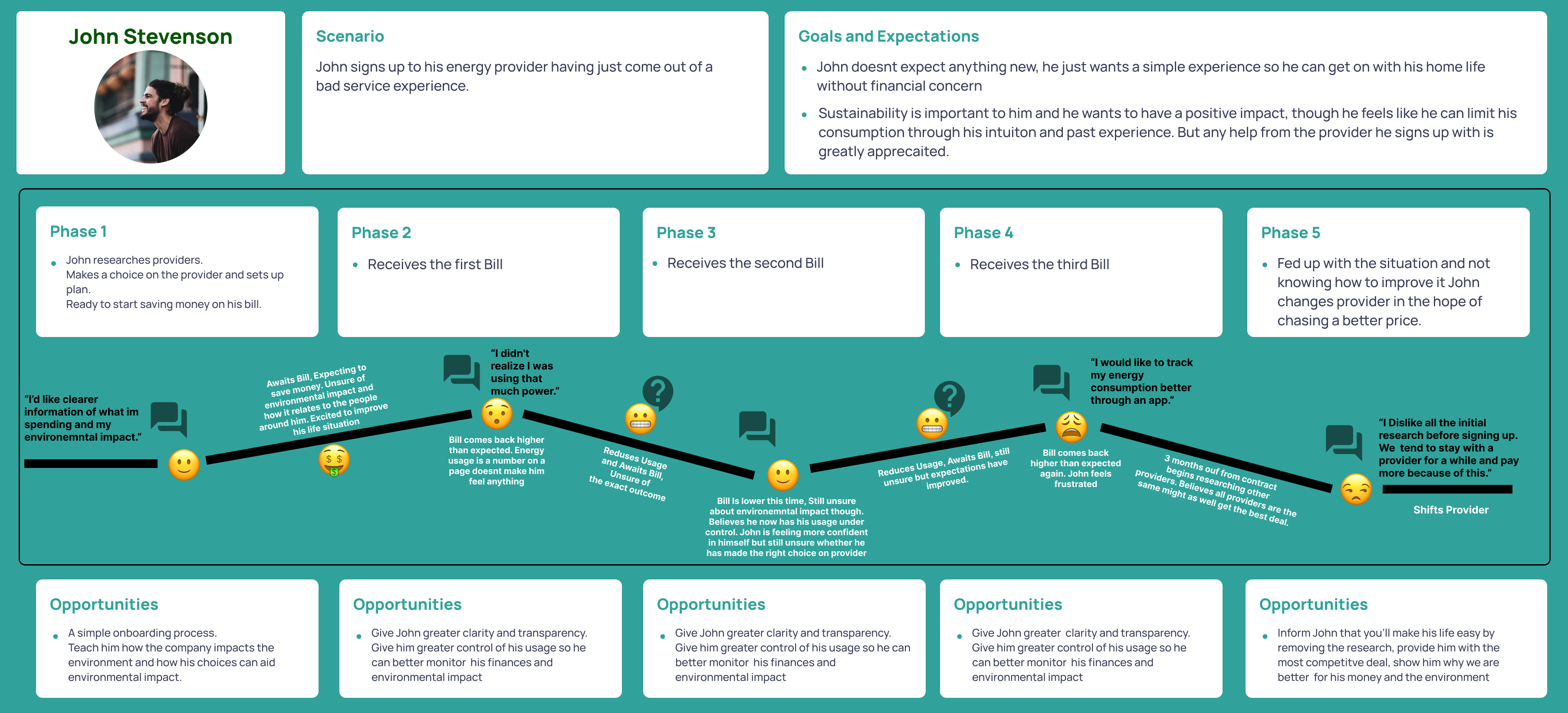
Surveying 10 homeowners. I found they don’t research sustainable home design. They use professionals to make informed decisions. I prepared interview questions to focus on sustainable choices in and around the home instead. During the interviews, the following insights were uncovered:
- Transparency and up-to-date data so that they can affect their usage.
- Electricity usage is the main concern
- Better pricing so they can improve their access to products and services that impact the environment.
- Greater Government and company involvement so they can improve their access to products.
Pivot to energy usage
I refocused the application around the user problem of Energy usage transparency. Learning that **bill shock can be reduced by giving users more control of their usage and precise data at critical moments. Having the flow-on effect of helping them be more sustainable. They can be easily retained as a customer if we provide them with competitive deals and a transparent comparison of energy-provider options.
Breakdown of usage & setting limits
To inform the design of the app I facilitated a workshop with 3 users closely matching the persona based on the how might we question “How can we make household energy usage more transparent?.” MVP Quick wins:
- A graph or diagram to explain usage.
- Day-by-day breakdown of energy-draining activities.
- Allowing users to set monthly limits in terms of money/usage.
Information Architecture I conducted an open card sort bringing users in to inform them how it should look to them. Areas expected by consensus of 5 participants were the following pages: Bill payment, Home screen, Overall usage, Appliance usage, and a My account/support page.
Info hierarchy still unclear
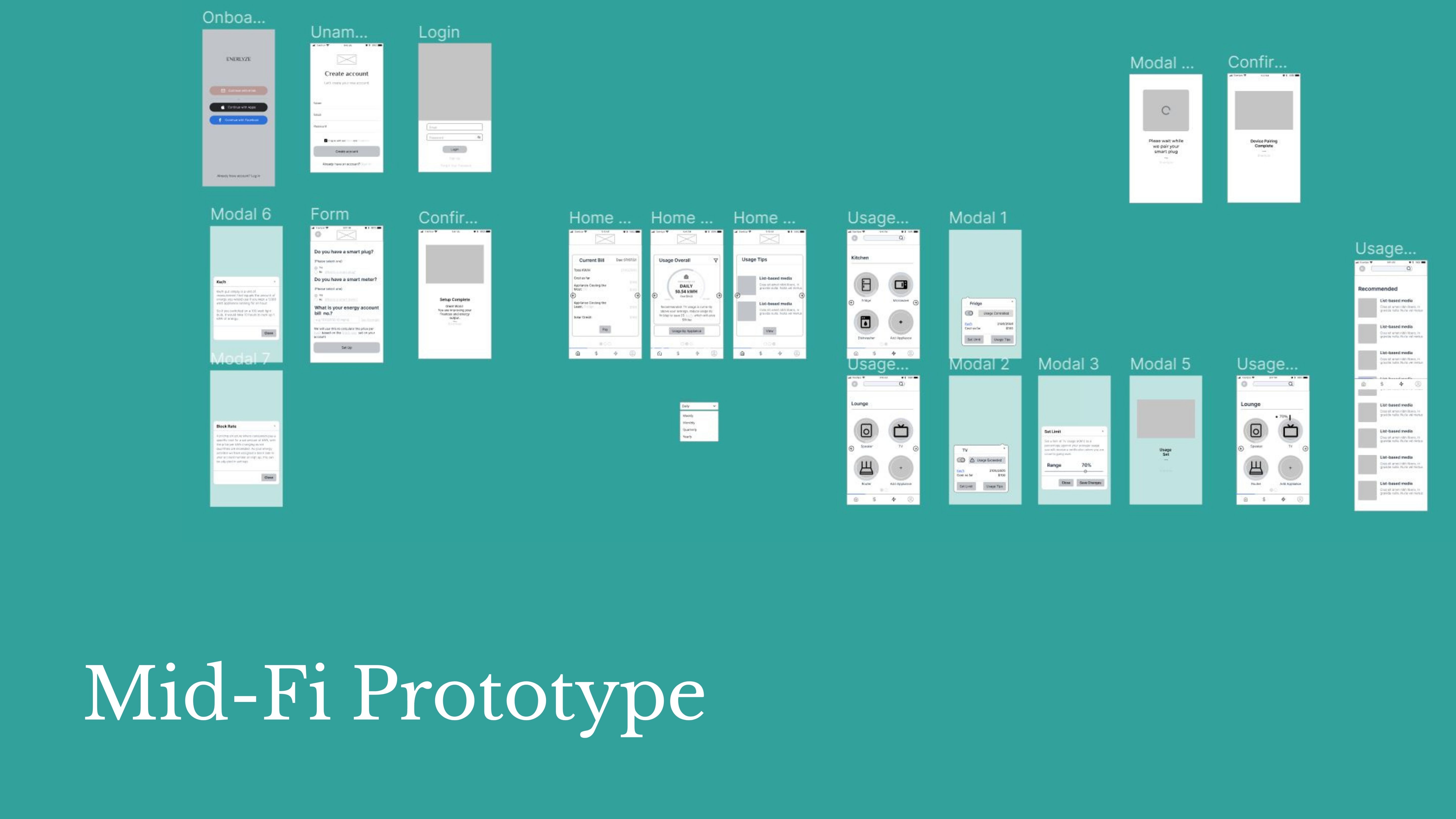
I used Material UI as a style guide with any custom components built to match common design patterns. Key insights found during testing were:
- Mid-fidelity wireframes were tested with 5 users through moderated testing
- I found account info on the onboarding page confusing
- Stated current bill and usage info as hard to find.
Validation
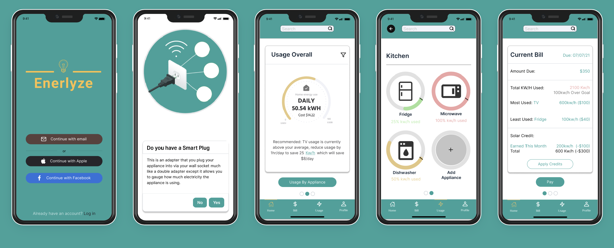
Hi-fidelity was then tested with 5 Users I learned that they preferred the banner at the top to be entirely green and blend with the logo and that they wanted more feedback on the usage graph with more functionality within the current bill screen.
Learnings
I learned how to use design thinking. I learned to timebox effectively. I began to trust my intuition and confidently challenge problems quickly and efficiently while always keeping the key user in mind. I’m proud of what I achieved in the 6-week timeline provided and, looking back now, I know I could go through the process in half the time as I know better where to apply design thinking intentionally. I’m proud I didn’t go in with a narrow focus. I’m also glad I had the understanding to pivot my research when I did maximising the time I was afforded.